Colégio das Faias
Portugal / 2019
Operating in Azeitão, in a semi-rural area in the skirts of Lisbon, Colégio das Faias is a school for children from 0 to 11 years old and was named after the tall trees that surround it. It is in this close relation to nature that the school builds the foundations for all its activity: children spend a large part of their day outside the classroom and learn many times without writing in notebooks, simply by experience and memory.
The new brand illustrates simplicity and diversity, with the 3 geometric shapes creating the tone for the graphic universe that will gain more and more complexity - just like a growing child.



From this idea that nature is the best place to learn and that learning is in our nature, the central idea of the new brand signature is born: Learning is Natural.
The color palette was created from the native flora of Serra da Arrábida and its landscapes, reinforcing the brand signature.
A family of graphic elements, inspired by the different stages of growth, was developed as a way to establish a relationship between the brand and children.
The different shapes can be applied randomly or combined to create new shapes, generating an ever larger and always new visual universe.

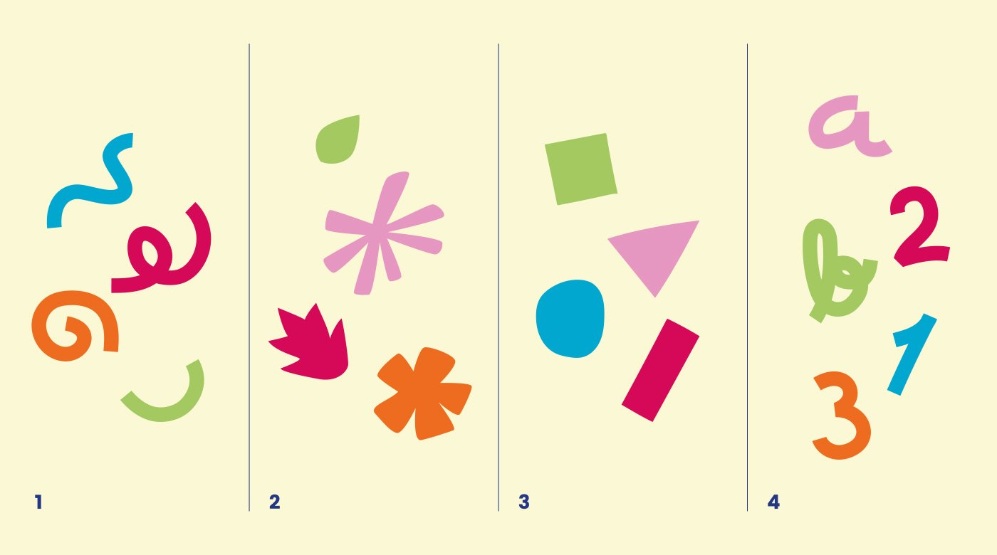


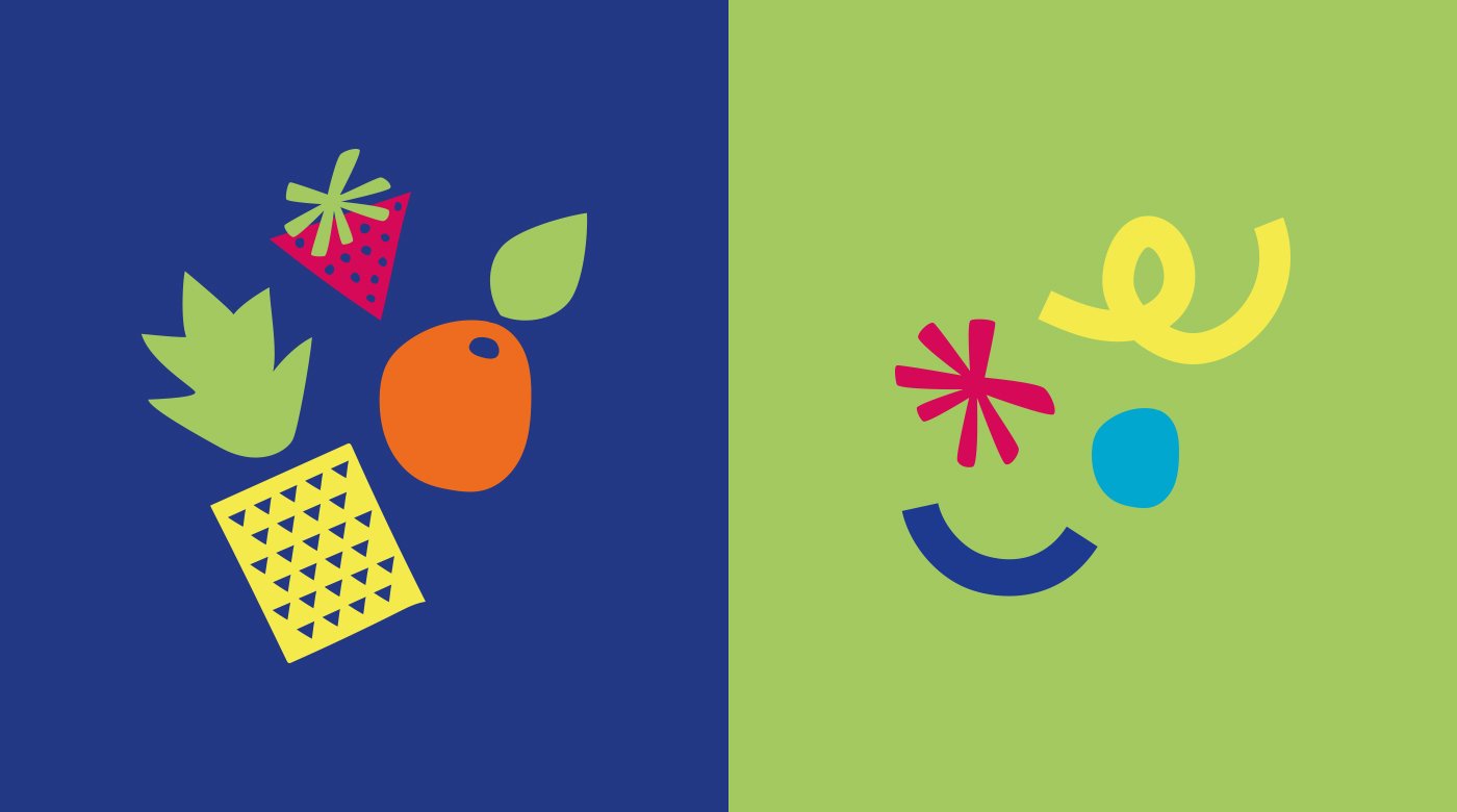


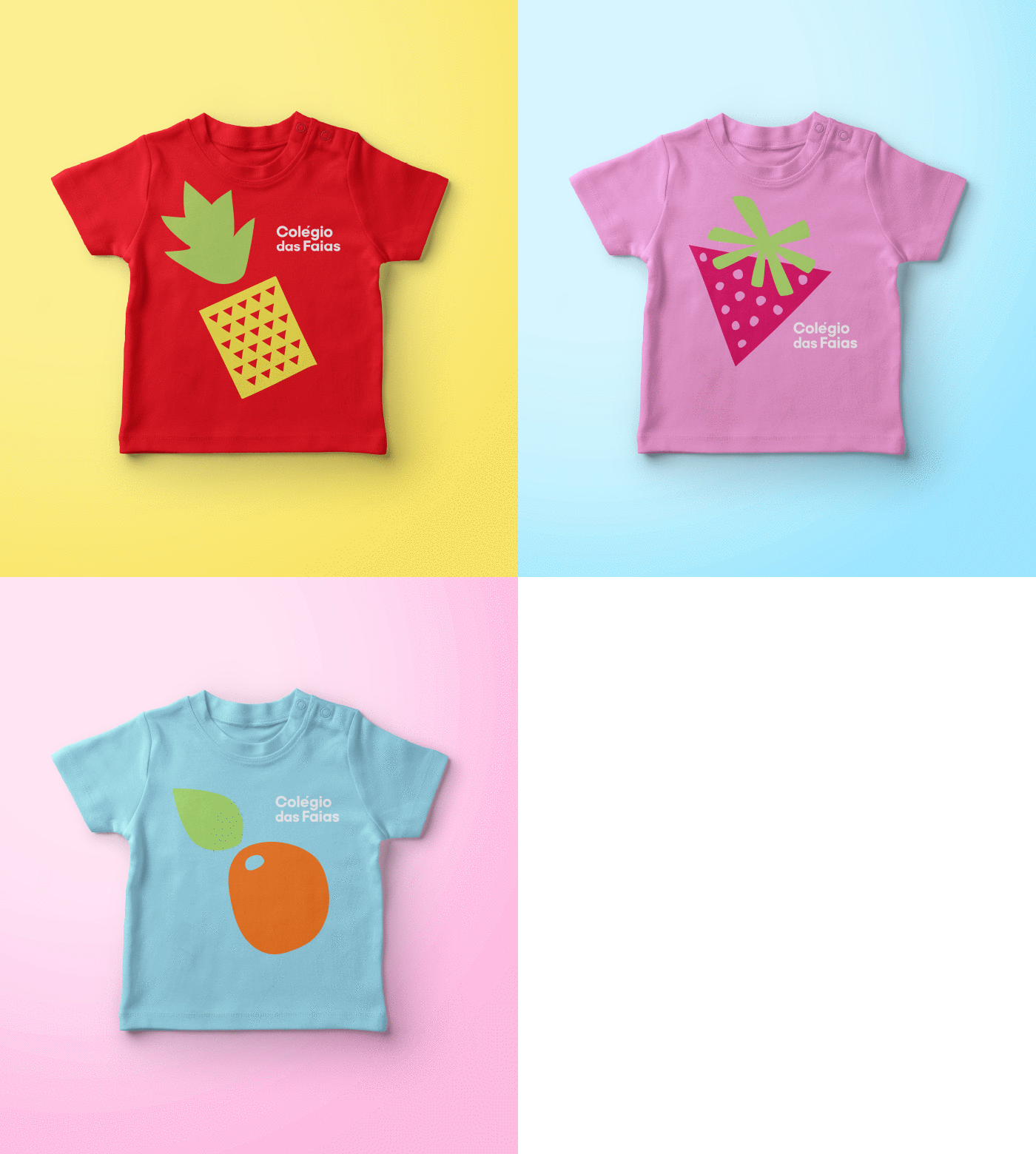
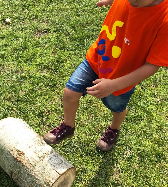
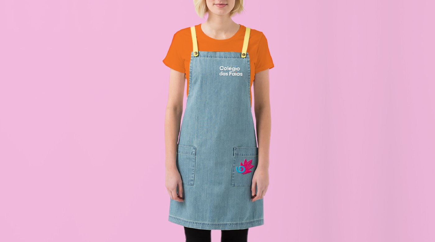
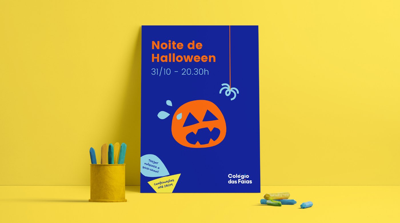

For the launching of the identity, a series of illustrations were drawn, simpler for the youngest and more complex for the older ones, to start creating recognition of the isolated forms and the countless possibilities in combining them.
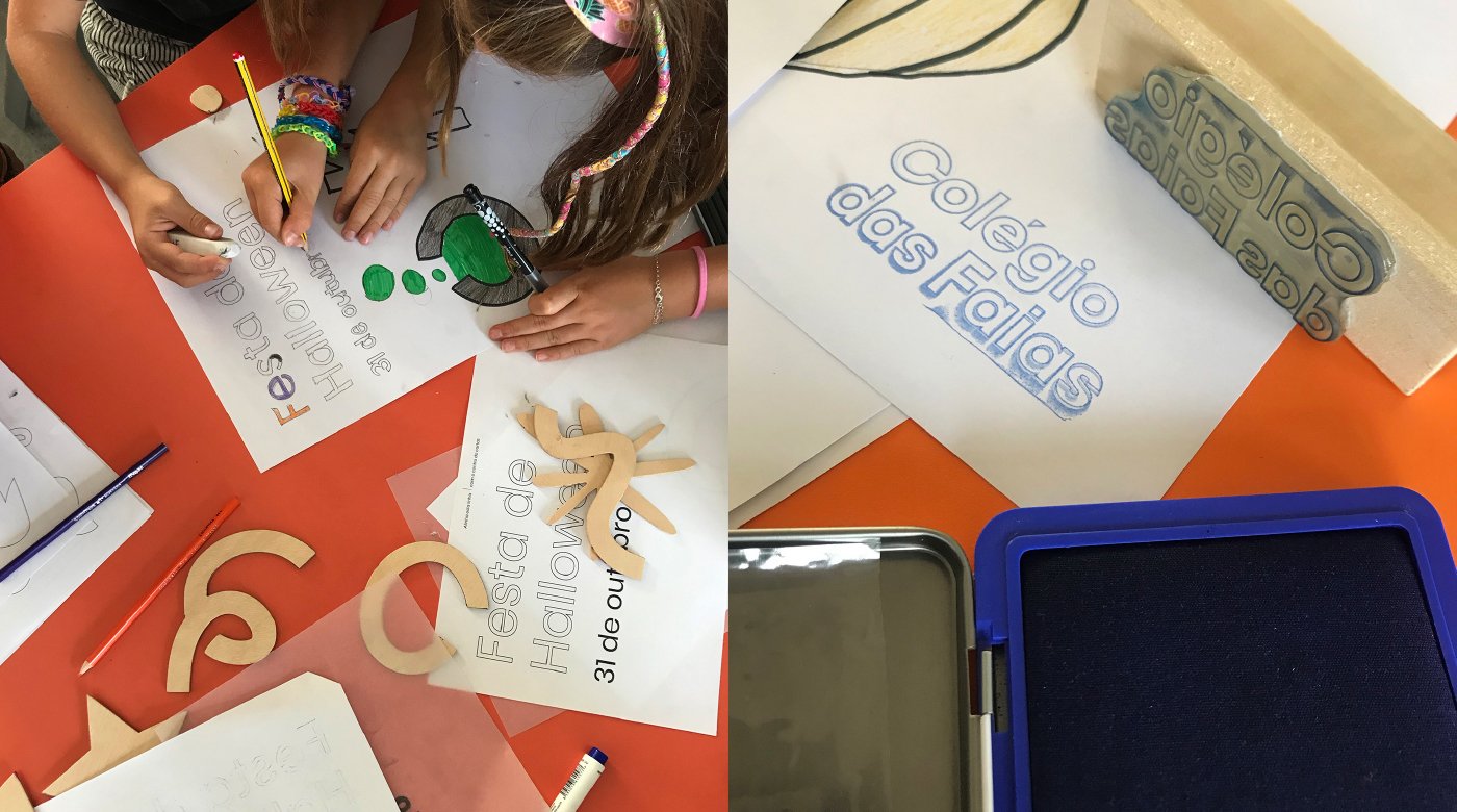
The next step was to create tools for the children to work on the graphic elements themselves and create their universes. Through wooden games and stamps, the magic began to happen.


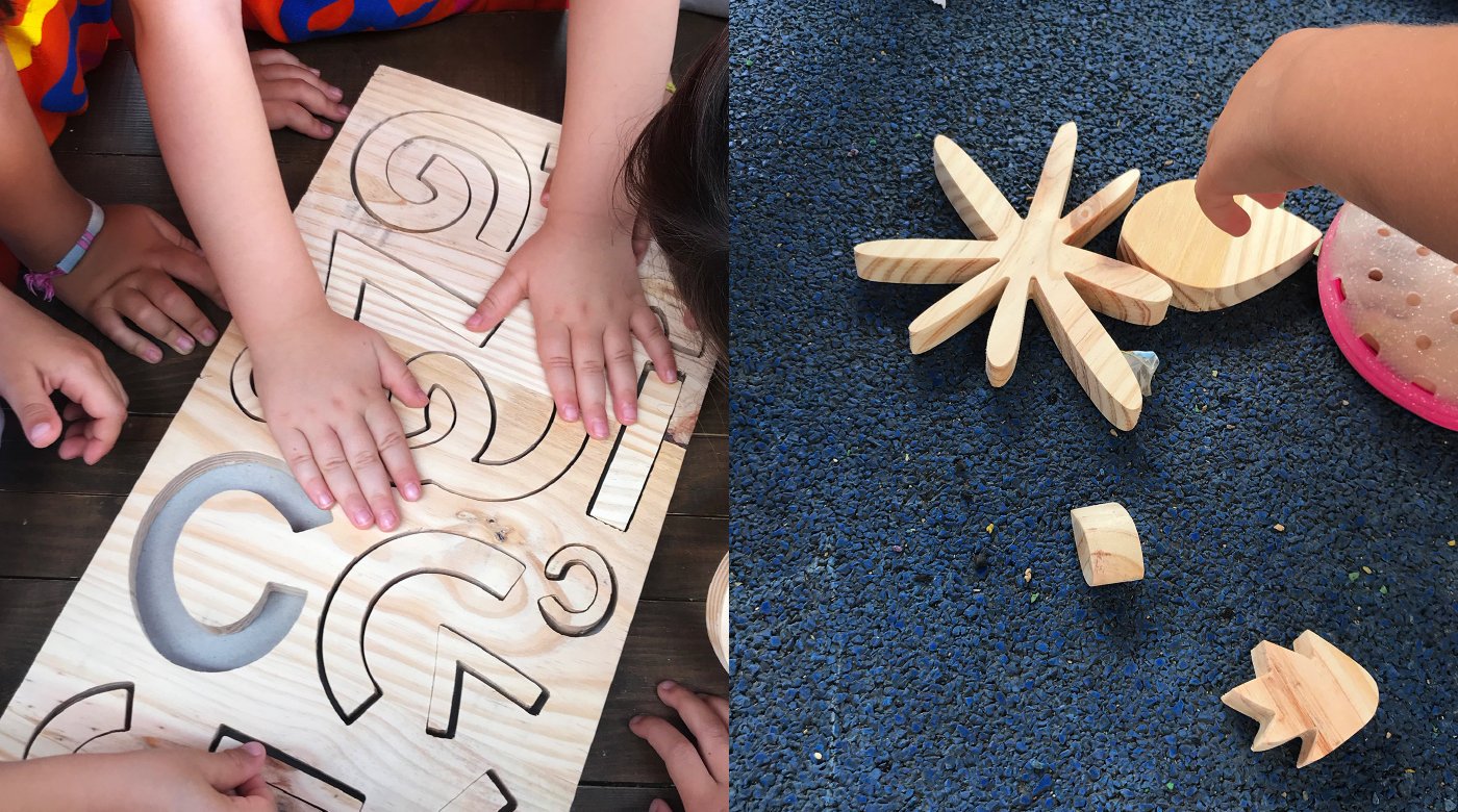


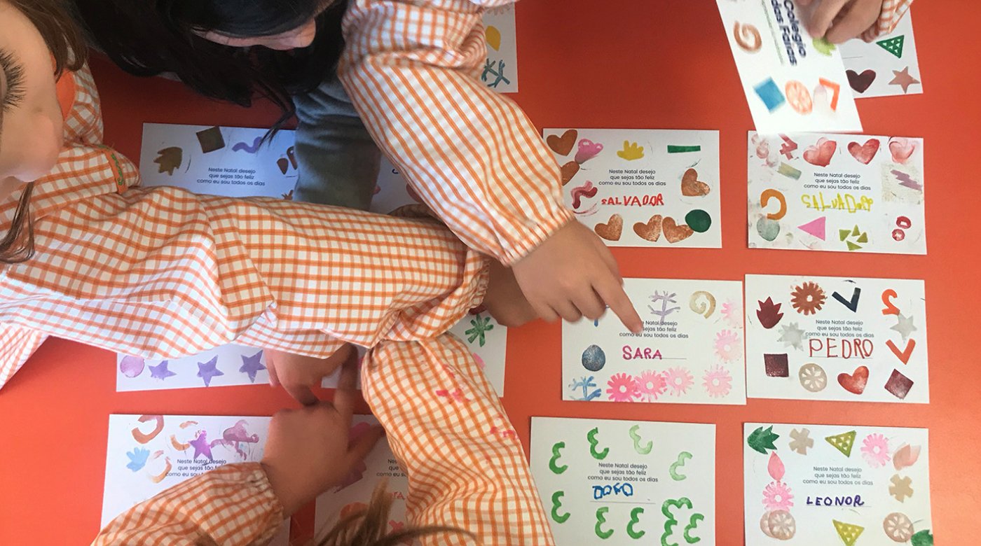

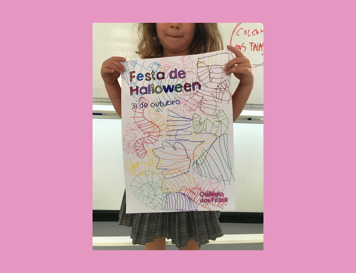
In the 1st Cycle (5-11 years) we took the experience further, in the “poster workshops”: using exclusively the graphic elements cut out of wood, we showed how to make the posters for the different College events.
From here, identity gained a life of its own and became a learning tool for everyone, closing the circle of the central message: here, learning is natural.

